What is the death cross? Definition, examples, and trading strategies

Picture a fast car and a slow truck on a highway. The car represents the short-term trend; the truck, the long-term trend. For a while, the car leads — that’s market growth. But as it slows and the truck keeps a steady pace, the truck eventually overtakes it. That crossover is the death cross pattern — the point where short-term bullish momentum gives way to a dominant, long-term bearish trend.
In the financial markets, the death cross pattern is a technical analysis tool that signals an approaching bear market. It shows that an asset’s price could decline meaningfully. It is a simple visual cue that suggests a major downtrend is coming.
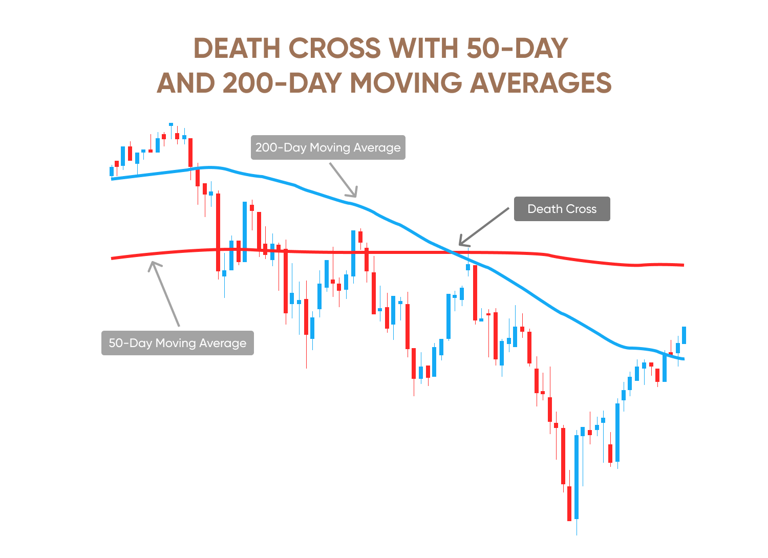
On a price chart, the death cross pattern happens when a short-term moving average (MA) crosses below a long-term MA. The most commonly used MA timeframes for this are the 50-day simple moving average (SMA) and the 200-day simple moving average (SMA). When the 50-day SMA crosses below the 200-day SMA, it is considered a bearish signal. It means the asset’s price may enter a long period of decline.
Remember, as with all technical analysis, while these patterns may give clues on potential future price action, past performance is not a reliable indicator of future results.
Origin of the term
The name ‘death cross’ comes from finance. It describes a serious and bad event. ‘Death’ means the end of a bull market, and ‘cross’ means the moving averages cross on a chart. The dramatic name shows the pattern’s importance. It can signal big market drops.
Moving averages involved
The 2 moving averages (MAs) used for death cross technical analysis are the 50-day and 200-day SMAs. The 50-day SMA is the average price of an asset over the last 50 trading days. It is a good way to recognise the short-term trend. The 200-day SMA is the average price of an asset over the last 200 trading days and reflects the long-term trend. The 200-day SMA is widely considered a major support or resistance level and a crucial measure of an asset’s health.
The pattern is important because it is not just one day’s event. It represents market behaviour over several months. It shows a weak short-term trend. It signals a big market shift.
Past performance is not a reliable indicator of future results.
Here's everything you need to know about the death cross pattern and how to use it in your trading strategy.
Practice recognising the death cross on a price chart and see what happens after a death cross forms under real-world market conditions without risking real money. Open a demo account.
Phases of the death cross formation
The death cross pattern forms in clear phases. It is a slow process. Understanding these phases is important.
Phase 1 – long-term uptrend
It starts during a strong, long-term uptrend, when the price is rising. The 50-day SMA is well above the 200-day SMA. This is the ‘golden cross’ phase. The market is in a bullish cycle. The price is making higher highs.
Phase 2 – growth peak and sideways movement
Next, growth slows down. The price stops rising fast and starts to move sideways. The distance between the two moving averages gets smaller. The short-term average starts to flatten.
Phase 3 – bearish crossover
This is the main phase. The 50-day SMA crosses below the 200-day SMA, forming the death cross. It confirms that short-term momentum has turned negative. It is weaker than the long-term trend. Many traders see this as a signal to sell.
Phase 4 – acceleration of the downtrend
After the crossover, the downtrend often gets faster. The price keeps falling. The 50-day SMA becomes a new resistance level. The 200-day SMA also becomes a strong resistance level. The market enters a confirmed bear phase.
How to identify a death cross on the chart
Spotting a death cross pattern can be easy. But a good analysis needs more than just the crossover.
Crossover logic
First, plot the 50-day and 200-day SMAs on a chart. The death cross is confirmed when the 50-day line crosses below the 200-day line. The logic is simple. Recent price declines are big enough to pull the overall trend down.
Timeframes
The most commonly used timeframe is the daily chart. But the pattern can also appear on weekly or monthly charts. Daily charts are best for identifying major trends, while weekly charts give a stronger signal if a crossover occurs here. It means a longer-term shift.
Volume confirmation
Volume is a key factor. A strong death cross often has high trading volume. This means many people are selling. This adds strength to the signal. A low-volume death cross can be a false signal.
Trading platforms
Popular trading platforms come built with tools to help you find the pattern on price charts. TradingView is a popular and easy-to-use platform with many technical indicators. MetaTrader 4 and 5 are among the most commonly used trading platforms due to their rich features and charting tools. The Bloomberg terminal and Eikon are advanced platforms, popular among institutional investors.
Learn more about the features of the TradingView platform and how to use it.
Death cross vs golden cross
It is important for traders to distinguish the golden cross vs the death cross for technical analysis. The golden cross is the exact opposite of a death cross. It signals that a downtrend is coming to an end and an uptrend is beginning.
In the golden cross, the 50-day SMA crosses above the 200-day SMA. It is a bullish sign, suggesting a new uptrend. In the death cross, the 50-day SMA crosses below the 200-day SMA. It is a bearish sign and suggests the beginning of a new downtrend.
Interpreting bull and bear market signals
The golden cross is considered a buy signal since it indicates that a new bull market has started. Traders tend to open long positions when they see this pattern. On the other hand, the death cross pattern is a sell or short-sell signal because it signals that a bear market will likely follow.
Which is more reliable?
Both are reliable indicators. But they are not perfect. Their reliability depends on the market context. Also, remember that both are lagging indicators. They confirm a trend that is already happening. This is a major limitation of these patterns.
Learn more about the different technical indicators and how to use them for technical analysis.
Historical examples of the death cross
You can better understand how the death cross pattern forms by looking at historical market data. Historically, the death cross often comes before big market drops.
The S&P 500 has seen the death cross many times. In early 2022, the pattern appeared just before a big market correction. It confirmed the bearish signal.
Similar death cross stock patterns were seen for Tesla and Apple. The pattern was seen for Tesla’s stock on April 15, 2025, followed by a sharp fall in stock price. The bearish sentiment continued through the summer, with the stock declining 10.74% YTD by the first week of September.
Historically, death crosses forming for Apple’s stock price have preceded major declines of over 17% before the price bottomed out. This also happened on March 13, 2024, when the 50-day MA crossed below the 200-day MA for the stock. This technical pattern is followed by a 3.6% drop in Apple’s stock price. Over the next 3 days, the stock plunged 19% before bottoming out.
The Dow Jones Industrial Average (DJIA) also had a death cross in early 2022. This event was part of a wider market fall. It was an early warning for investors.
On April 14, 2025, the S&P 500 and Nasdaq 100 indices formed the death cross stock pattern. Their 50-day MA crossed below the 200-day MA, signaling a potential shift to a bear market trend. However, in this instance, the death cross was a rare occurrence, driven by increasing geopolitical and economic uncertainties. It was followed by a sharp market bounce that continued through the summer of 2025. This highlights the importance of using other indicators to confirm signals before making a trading decision.
Stay updated with the latest news and developments with expert market analysis.
Past performance isn’t a reliable indicator of future results.
What happens after a death cross?
You need to know what happens after a death cross to plan your trades. The period after the crossover has a specific market behaviour. So, look out for it.
In the short term, the price might bounce up for a while. This can be a ‘bear trap.’ A bear trap is a false signal that tricks traders into believing that the price will keep falling. A death cross is a strong bearish signal, so many traders might short sell the asset, expecting a prolonged downtrend. A bear trap happens when the price, instead of continuing to fall, unexpectedly reverses direction and rises sharply. This ‘traps’ the traders who expected the price to continue dropping, forcing them to buy back the asset at a higher price to limit their losses.
The real impact of a death cross pattern can be seen in the long term. The pattern often starts a long downtrend. After a death cross, the 200-day SMA, which was a solid support level, often becomes a major resistance level. This means that if the price tries to recover and rise, it is likely to struggle to break above this long-term SMA. Each attempt to cross back above the 200-day MA would be met with strong selling pressure, reinforcing the bearish trend. This creates a ‘ceiling’ that the price finds difficult to break through.
Although the death cross is a strong signal, it can reverse. Unexpected good news or a change in government policy can make the price go back up. For a true reversal, the price must go back above the 200-day SMA. This could later lead to a golden cross.
The death cross pattern has a big psychological impact. It can cause panic selling. This drives the price down even further, fuelling the downtrend.
Trading strategies using the death cross
The death cross pattern is a base for many trading strategies. Here’s a look.
Short-selling setup
A death cross signals a potential downtrend, creating an opportunity for a short-selling setup. A trader can borrow and sell units of an asset, expecting its price to fall. They can then buy the asset back at a lower price, profiting from the difference. This strategy directly capitalises on the bearish signal.
Hedging positions
Long-term investors can use a death cross to hedge their positions. Instead of selling all their assets, they can buy put options or short-sell a portion of their holdings. This creates a safety net, offsetting potential losses if the market continues to fall. It is a risk management strategy to protect a portfolio from a bear market without fully exiting it.
Entry/exit planning
Traders can use the pattern to identify clear signals to exit a long position, minimising potential losses from a major trend reversal. Aggressive traders can use the pattern to plan an entry for a short position, once the crossover confirms the start of a bearish trend.
Stop-loss placement
Proper stop-loss placement is crucial for all types of trading strategies. A common strategy while using the death cross pattern is to place a stop-loss order just above the 200-day SMA. If the price rallies and crosses back above this key resistance level, the bearish signal may be invalidated. This helps traders limit potential losses if the predicted downtrend fails to materialise.
Learn more about different trading strategies to find one that suits your trading style and goals the best.
Advanced variations of the death cross
There are more advanced ways to use the death cross in technical analysis. However, these are more suited to experienced traders.
Double death cross
A double death cross is a stronger signal. Here, the trader waits for a short-term moving average (like the 20-day SMA) to cross over the 50-day SMA. Then the 50-day SMA crosses the 200-day SMA. This confirms the bearish momentum.
Timeframe stacking
Here, traders use multiple timeframes to confirm the beginning of a bearish trend. They look for the death cross on the daily chart. Then, they check the weekly chart. If the pattern appears on both charts, it is a much stronger signal.
Is the death cross a lagging indicator?
The biggest drawback of the death cross pattern is that it is a lagging indicator. The pattern forms after a price drop has already started. A lot of this price decline may have already happened. This can mean a late entry for traders.
Also, the pattern can give false signals in volatile markets. An asset may correct briefly, which triggers a death cross. Then the price rebounds. These ‘bear traps’ can cause big losses.
These factors make it important to combine the death cross with other technical analysis tools. For instance, the relative strength index (RSI) can be used to check whether the market is in overbought territory to confirm a downtrend. Also, a bearish moving average convergence divergence (MACD) crossover helps confirm the signal. Since high volume is one of the factors that confirms the trend reversal from bullish to bearish, volume indicators like on-balance volume (OBV) can also be used.
Learn more about different indicators to strengthen your technical analysis skills.
Pros and cons of trading with the death cross
Like all other technical indicators and chart patterns, the death cross too has its good and bad points.
The main advantage is that this pattern is easy to see and understand. Also, it gives a long-term view of the price trend. This macro view is very helpful for long-term investors. Historically, the pattern has usually accurately predicted market declines. This makes it a reliable indicator.
However, as mentioned earlier, the death cross is a lagging indicator. This means it only provides a signal after a price decline has started. Plus, it can give false signals in sideways markets. Finally, the pattern only shows that the price is likely to decline. It does not say how low the price will go. This makes exit points hard to set. This is why using other indicators to confirm the signal is useful.
Ready to use the death cross pattern in your trading strategy? Open a live account.