12 chart patterns for traders
Discover top chart patterns every trader should know – learn how to trade 12 continuation and reversal patterns via CFDs or spread betting with Capital.com.
What is a chart pattern?
Chart patterns are formations that appear in trading charts, reflecting the behaviour of asset prices over time. These patterns are a core concept in technical analysis, often used by traders in CFD trading and spread betting to identify market trends and predict potential price movements.
By learning the distinctive traits of different chart patterns, traders can interpret and understand what they indicate, and use technical indicators and analysis to help confirm or challenge the validity of a chart pattern when it forms.
A pattern might provide bearish, bullish or neutral signals depending on the shape and angle of the trendlines, and the market conditions at the time.
Common types of chart pattern
Two types of patterns commonly show up in trading charts – continuation patterns and reversal patterns – and each has bearish, bullish and neutral variants.
Continuation patterns indicate that a current trend will continue. These patterns are typically symmetrical, and appear during a pause in the current trend – indicating a temporary consolidation before the trend resumes.
For example, when an asset’s price is rising and a continuation pattern forms, the price may continue rising after the pattern completes. Conversely, if price is in a downtrend, a continuation pattern usually signals price will keep falling after the pattern is complete. If price is moving sideways, the continuation pattern often indicates it will remain in that range.
Reversal patterns, which include falling wedges, shooting stars and head and shoulders, – signal that the market may move opposite to the current trend.
These patterns often form at the end of a well-established trend, signalling a shift in direction. In an upward trend, a reversal pattern signals a potential bullish-to-bearish shift. During a downtrend it suggests a move from bearish to bullish.
Trading volume tends to increase after the pattern ends, indicating a spike in activity.
Top chart patterns
When it comes to ‘top’ chart patterns, there’s no such thing as a ‘best’ or ‘worst’. Instead, chart patterns are simply indicators of potential future market activity. Whether these signals are positive or negative depends on your open positions when the pattern forms.
Let’s look at 12 chart patterns that you might come across when trading.
Triangles
Triangles are patterns that often signal the continuation of a previous trend. They’re formed by two straight lines: an upper trendline and a lower trendline, that meet to form a triangle-like shape.
-
The upper trendline, or supply line, connects a series of price peaks, indicating overbought conditions – where supply outweighs demand.
-
The lower trendline, or support line, connects a series of price lows to highlight oversold conditions.
As these lines move closer together, you might expect narrowing price volatility as the market consolidates. If the price breaks out in the direction of the prior trend, the triangle acts as a continuation pattern, but a reversal may occur if the price moves in the other direction.
There are three variations of the triangle: symmetrical, ascending and descending..
Ascending triangle
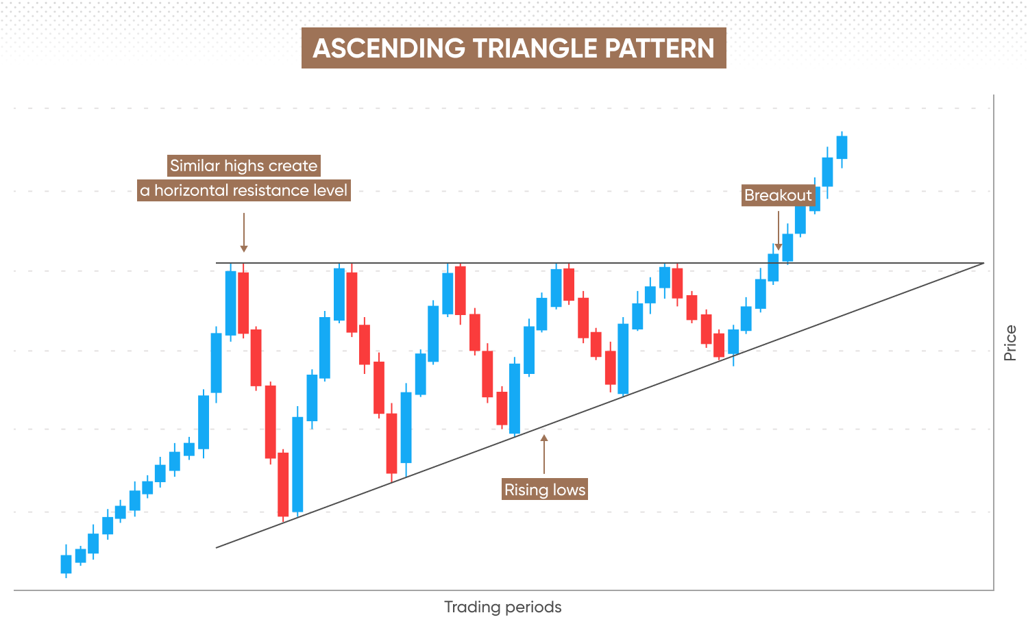
While ascending triangles may signal the continuation of a bullish trend, they can also appear during downtrends to signal a reversal.
-
The upper trendline connects a series of near-identical peaks to create a horizontal resistance level.
-
The lower trendline connects rising lows at a diagonal angle.
When the volatility narrows and the trendlines converge, the price may break out of the resistance level and continue the uptrend.
Descending triangle
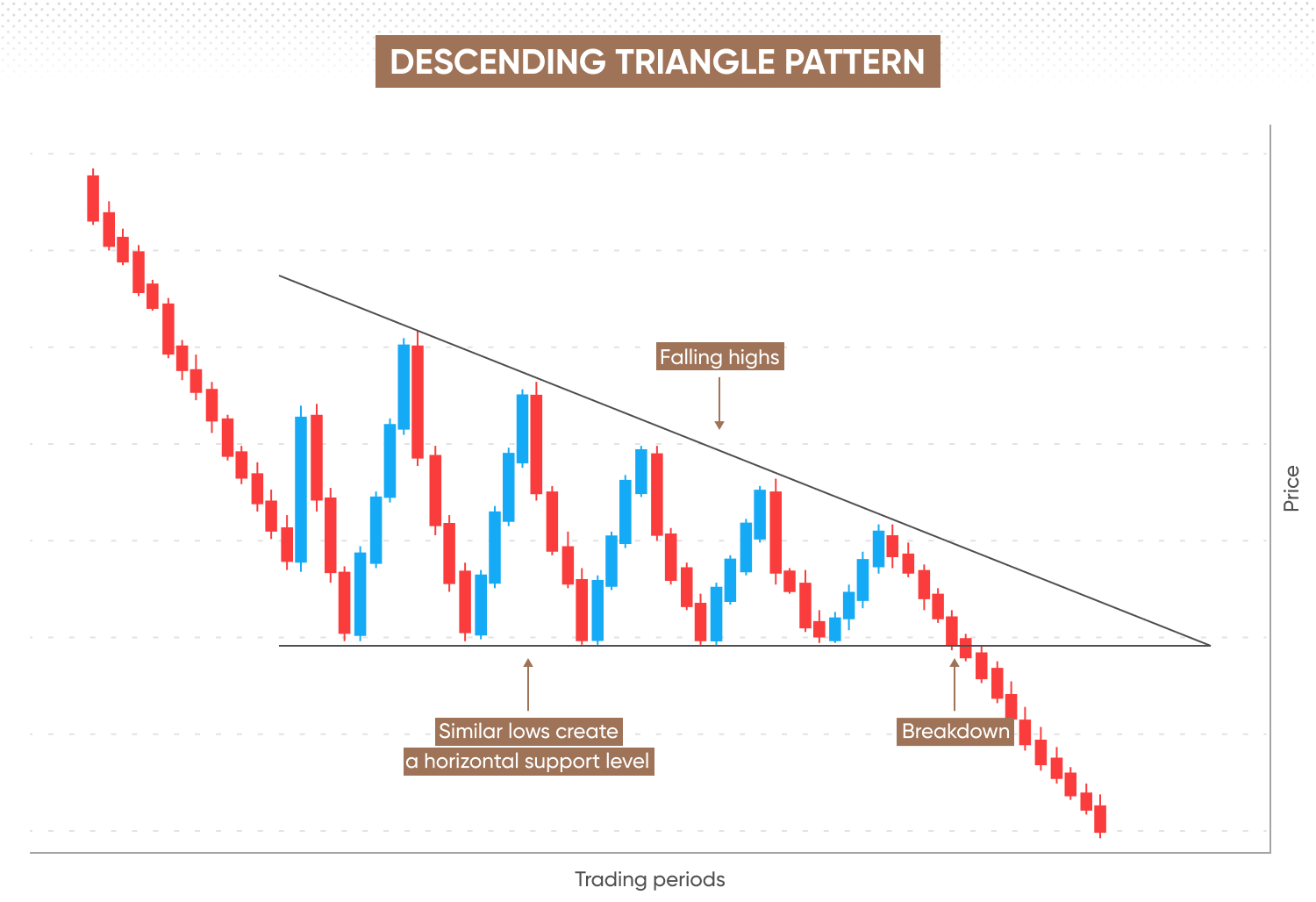
Conversely, a descending triangle suggests a bearish trend will resume. Its shape is like an inverted ascending triangle.
-
The lower trendline connects a series of near-identical price points to create a horizontal support level.
-
The upper trendline connects descending peaks to form a diagonal angle.
When trendlines meet, the price may break below the support level and continue the downtrend.
Symmetrical triangle
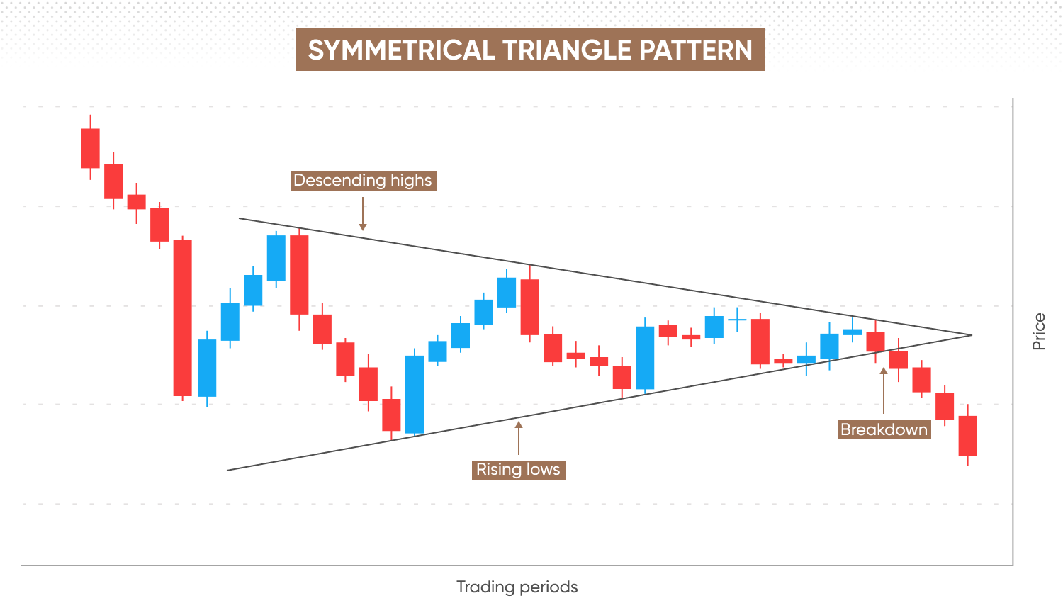
Symmetrical triangles represent a neutral continuation pattern that may form during bearish, bullish or horizontal trends.
This triangle is characterised by declining peaks and rising troughs. The market may break through one of the trendlines as they move towards an apex as the price range narrows.
If the symmetrical triangle appears during a bull market – the price may break above the upper trendline, and the uptrend may resume. In a bear market, the price may break below the lower trendline, and the downtrend may resume. During market consolidation, the price may continue to trend in a horizontal direction.
Pennants
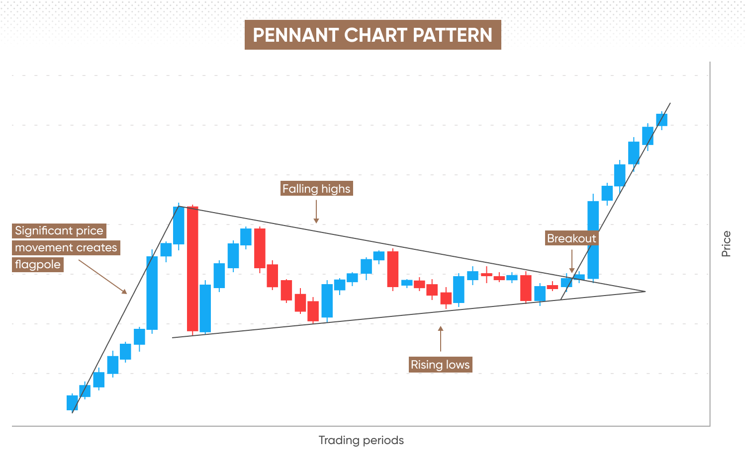
Pennants are chart formations that may signal the continuation of a bullish or bearish trend following a consolidation phase.
Here, significant movement in price creates a ‘flagpole’, followed by a period of market consolidation. A pennant forms when declining highs form a downward-sloping upper trendline, and ascending lows form an upwards-sloping lower trendline, creating a triangular shape.
As the price range narrows within the pennant, the price may become increasingly likely to break through the upper or lower trendline, meaning a potential resumption of the trend. After the breakthrough, market momentum may mirror the initial significant price movement and form a second ‘flagpole’.
Flags
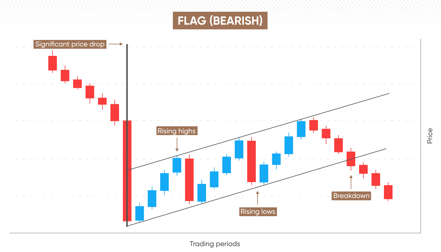
Flags appear during a temporary period of low volatility, or market consolidation, to indicate that a previous trend may resume. They have an upper and lower trendline, with two flagpoles which form a rectangle-shaped continuation pattern.
-
A significant price movement occurs, forming an upwards (bullish) or downwards (bearish) facing ‘flagpole’.
-
Price action slows down, and the market consolidates.
-
A trend resumes in the opposite direction to the preceding significant price movement.
-
Resistance and support lines run parallel in an upward or downward sloping channel, forming a rectangle-like 'flag'. An upward-sloping flag generally appears in a bearish trend, while a downward-sloping flag forms in a bullish trend.
-
Price movement breaks either above the resistance in a bullish flag (signalling a continuation of the uptrend) or below the support in a bearish flag (indicating a continuation of the downtrend). The breakout typically creates a second flagpole that mirrors the size of the first pole.
Unlike in pennants and triangles, the lines that appear in a flag pattern do not converge. If you see a pattern that looks like a flag but has converging lines, it may be a wedge or pennant pattern instead.
Wedges
Wedges may emerge when a trend is about to reverse in the opposite direction to the prior trend. They have an upper trendline and a lower trendline that converge, forming a wedge-like shape. Trendlines in a wedge rarely meet, as they’re disrupted once the price inevitably breaks through.
This pattern’s bullish variant is the falling wedge, while its bearish version is the rising wedge. Whether it's the bullish or bearish variant that shows up, the lower trendline will always be steeper.
Rising wedge
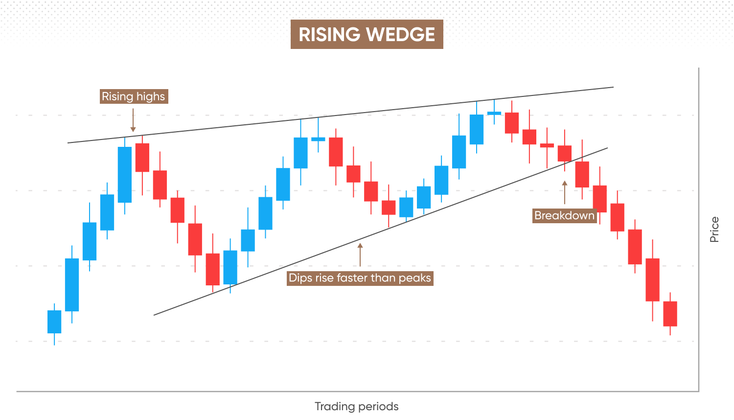
Rising wedges signal a bearish reversal to an uptrend.
Both trendlines slope upwards, with the upper trendline connecting progressively higher highs, and the lower trendline connecting a series of higher lows. Notice how the lower trendline has a steeper angle; this is because the market lows rise faster than the highs.
The pattern is completed when the price continues to decline after it breaks below the lower trendline.
Falling wedge
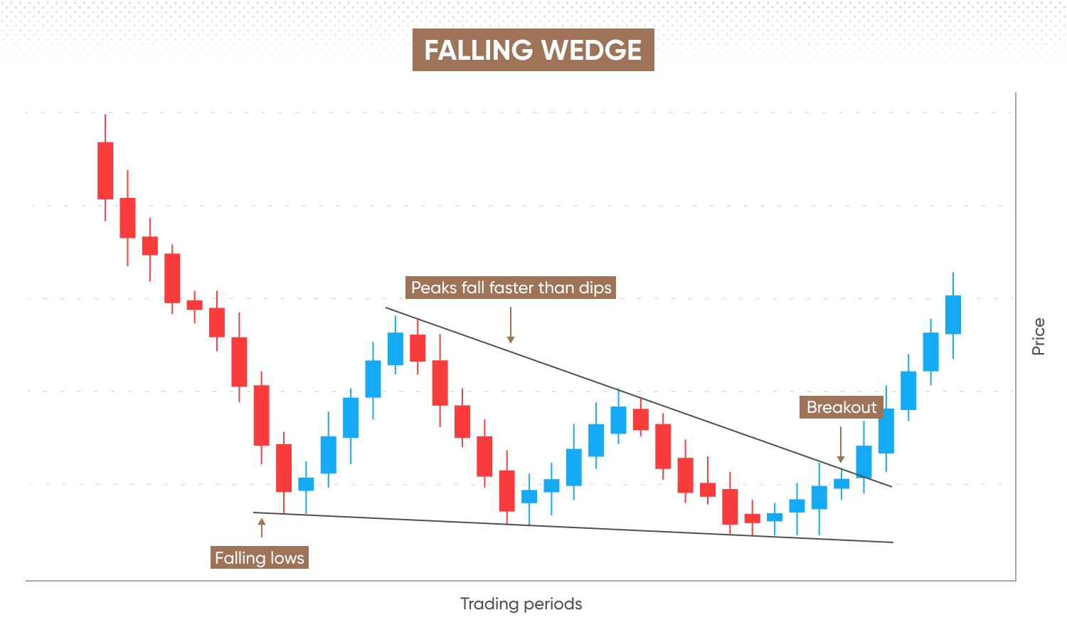
Falling wedges signal a bullish reversal during a downtrend.
Both trendlines slope downwards: the upper trendline connects a series of lower highs, while the lower trendline connects progressively lower lows. Here, the upper trendline has a steeper angle, due to the highs falling faster than the lows.
The pattern is completed when the price continues to rise after it breaks above the upper trendline.
Shooting star
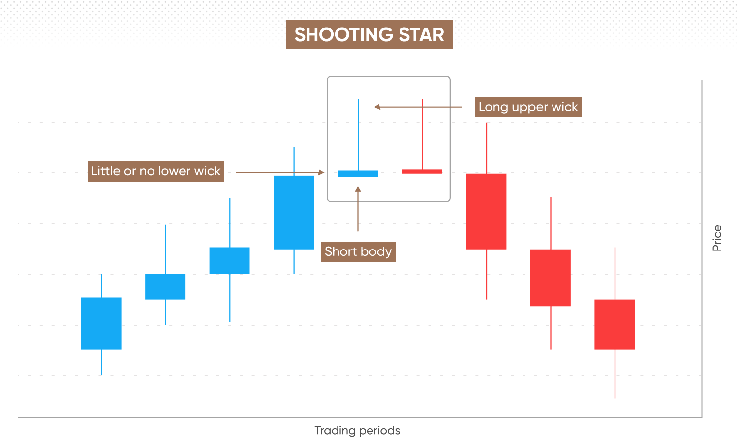
Shooting stars are bearish reversal patterns that only appear after an uptrend, indicating that upward momentum has plateaued and signalling a potential reversal or retracement.
This pattern consists of a single candlestick, recognisable by its small body, long upper wick, and little to no lower wick.
-
The price moves in an upward direction during the session.
-
The open, low, and close prices are similar or the same.
-
The high price is significantly higher than the open and close, creating a long upper wick and a short body, with minimal or no lower wick.
If you spot this pattern during a downtrend, it's more likely an inverted hammer, which signals a potential bullish reversal rather than a bearish one.
Inverted hammer
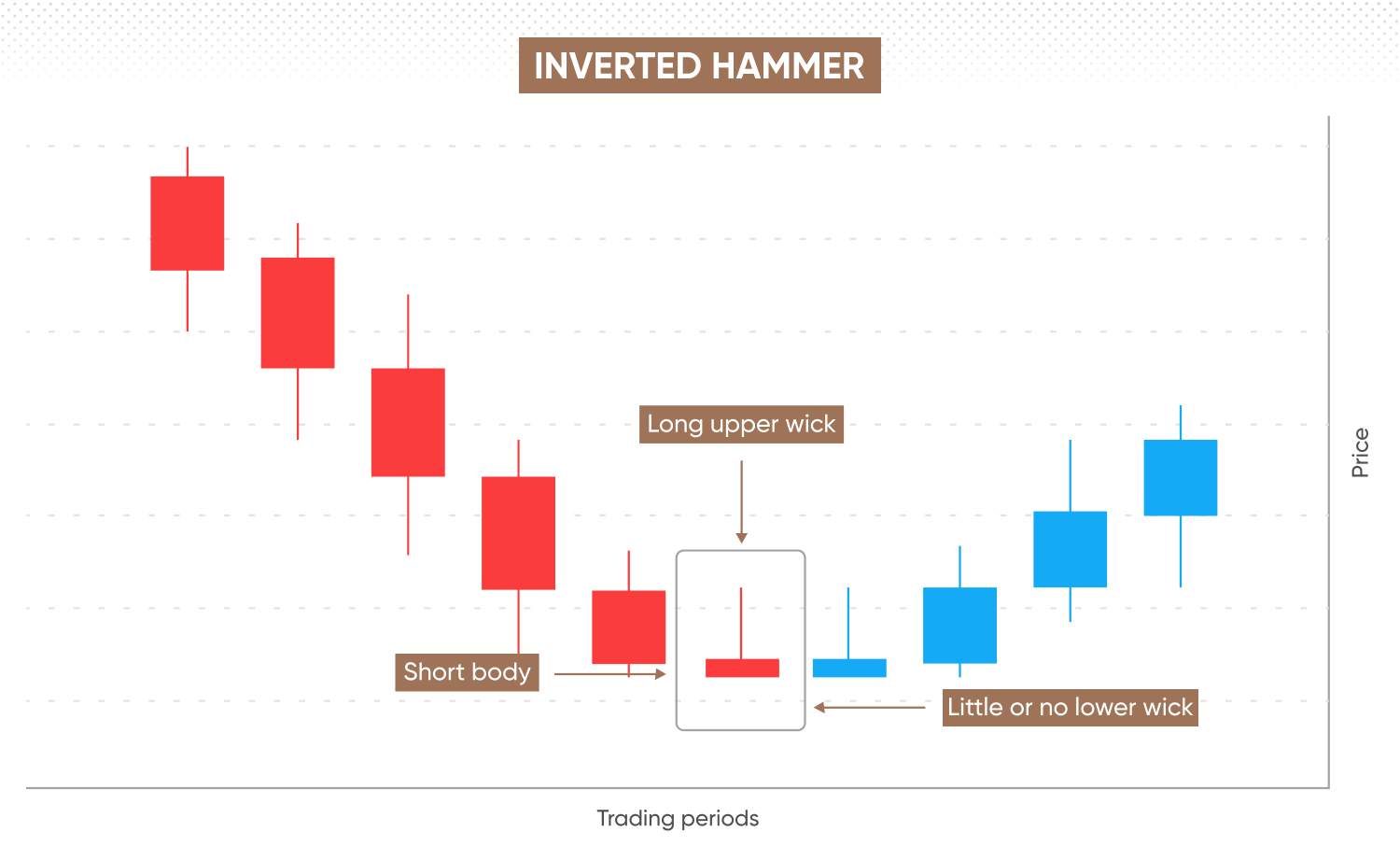
Inverted hammers, the bullish counterpart to the shooting star, look similar in appearance but occur during a downtrend, signalling a potential bullish reversal.
-
Shooting star – A bearish reversal pattern that forms at the height of an uptrend.
-
Inverted hammer – A bullish reversal pattern that forms at the bottom of a downtrend.
To differentiate between the two, consider the market conditions leading up to the pattern. A shooting star appears in an uptrend and signals bearish reversal, whereas an inverted hammer forms in a downtrend and suggests a bullish reversal.
Evening star and morning star
Evening and morning stars are reversal chart patterns that signal a shift in market sentiment. Both form over the course of three candlesticks, each representing a single trading period.
Morning stars are bullish, indicating a potential reversal of a prior downtrend. Conversely, evening stars often appear before the bearish reversal of an uptrend.
Morning star
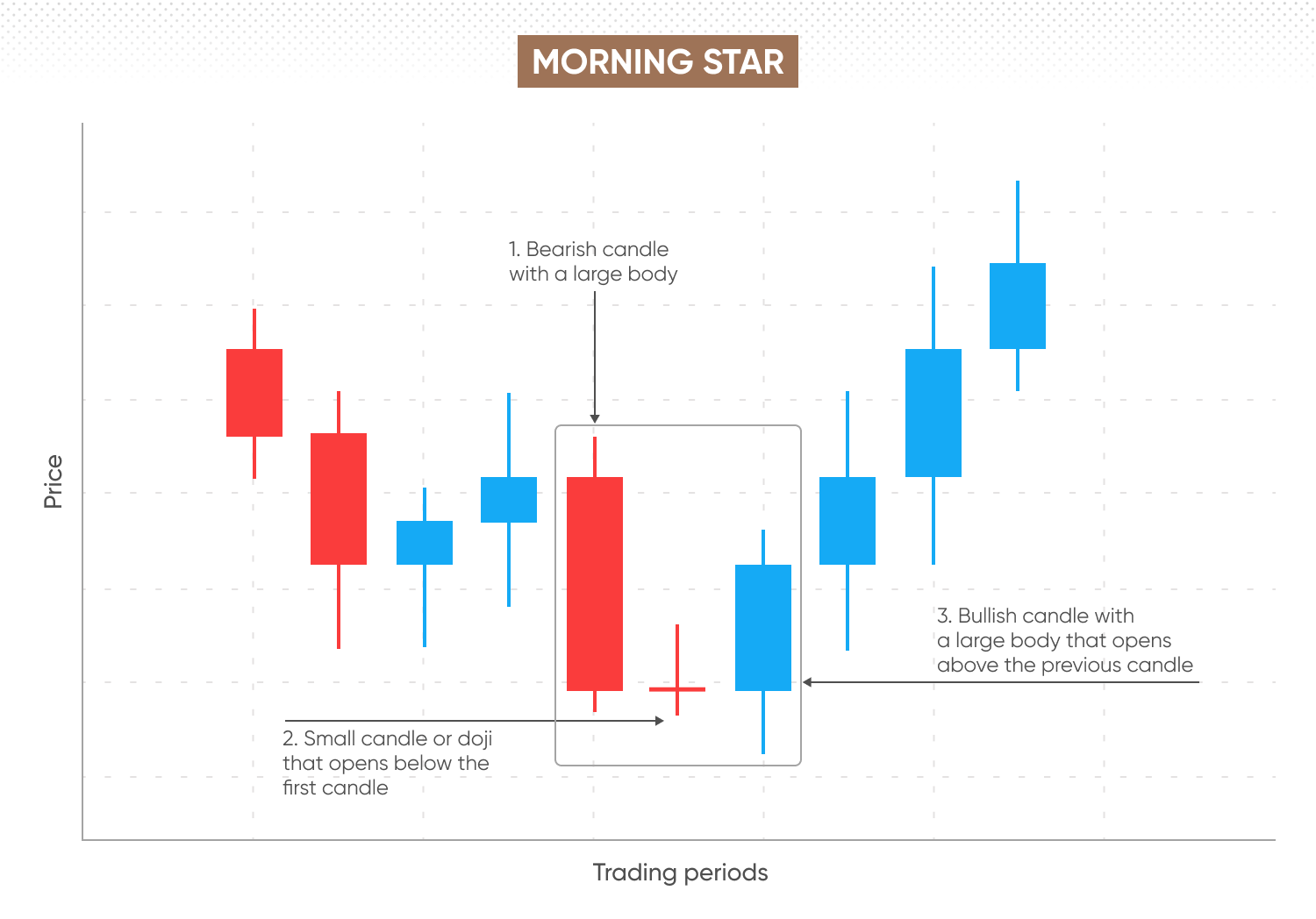
Morning stars form at the tail-end of a downtrend, signalling a potential bullish reversal. The pattern emerges when three candlesticks display distinct characteristics in a specific sequence:
-
The first trading period features a bearish candle with a large body, indicating strong selling pressure.
-
The second trading period is a small candle or a doji with a short body, opening below the first candle’s close, reflecting indecision in the market.
-
The third trading period is a bullish candle with a large body, opening above the second candle, signalling renewed buying interest.
The reversal is confirmed if the price continues to rise in the days following the formation of the morning star pattern.
Evening star
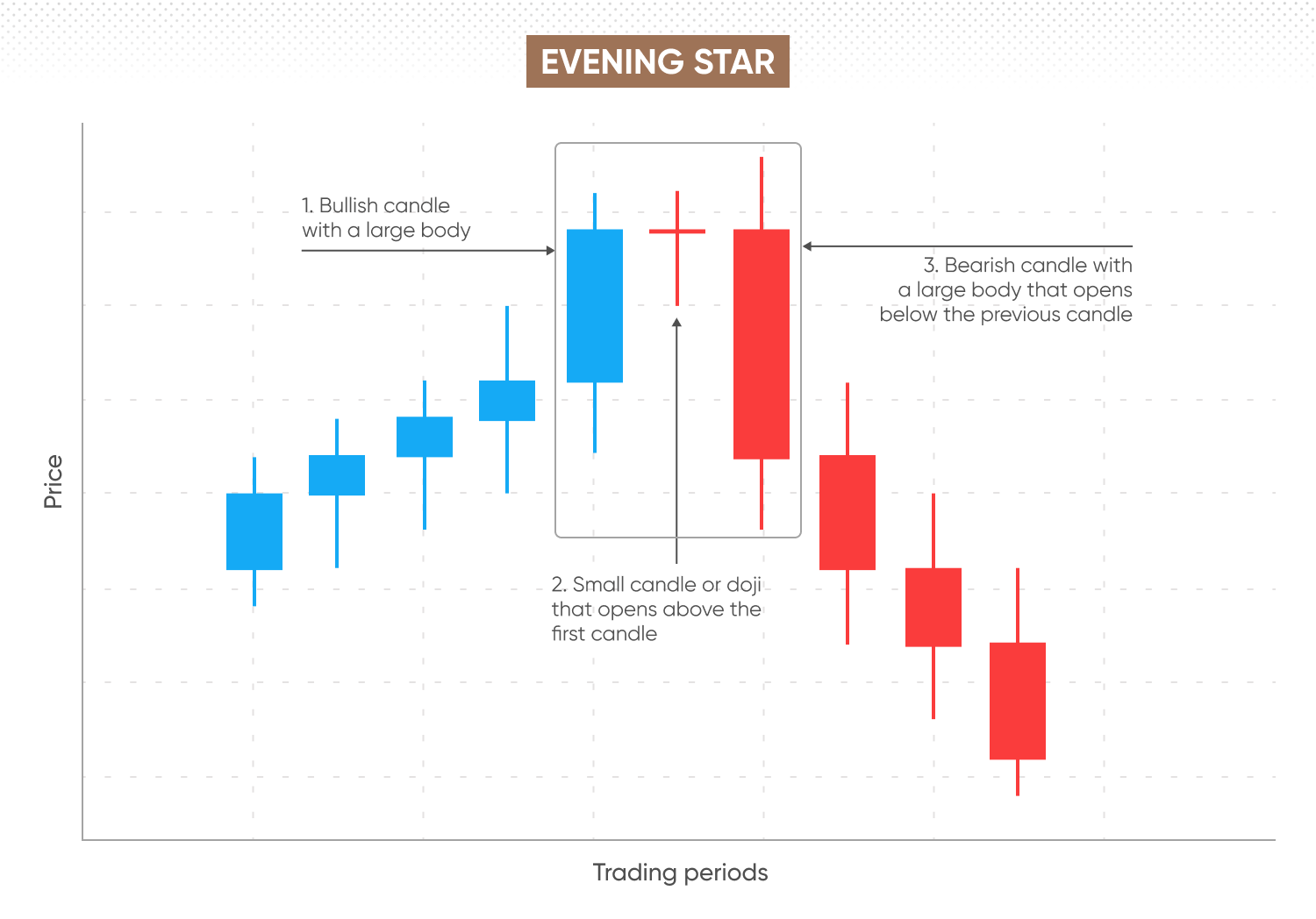
Evening stars form after an uptrend, signalling a potential bearish reversal. The pattern emerges when three candlesticks display the following characteristics in sequence:
-
The first trading period features a bullish candle with a large body, reflecting strong buying momentum.
-
The second trading period is a small candle or doji with a short body, opening above the first candle’s close, indicating indecision in the market.
-
The third trading period is a bearish candle with a large body, opening below the second candle, signalling a shift towards selling pressure.
Often, the third candle shows higher trading volume, reinforcing the strength of the reversal. The reversal is confirmed if the price continues to decline in the days following the pattern’s formation.
Rounding tops and bottoms
Rounding tops and rounding bottoms are reversal patterns that signal when a trend may be about to shift direction. They emerge over weeks or months, when you can connect the candlesticks on a price chart to form a smooth and rounded curve. Often, the trading volume is lower in the middle of the curve, and higher at each end.
Rounding bottom
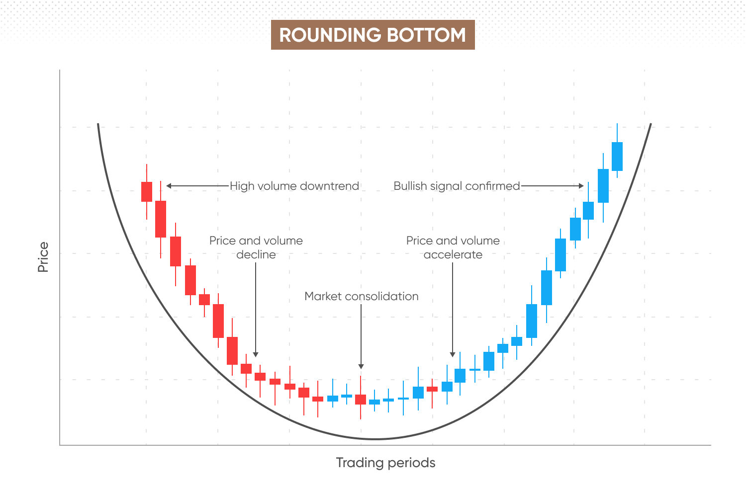
Rounding bottoms are bullish patterns where the candlesticks form a curve resembling a ‘U’ shape, signalling that an extended downturn is gradually reversing and will likely trend upwards.
-
The curve begins with a decline, during which trading volume is high due to bearish pressure.
-
As the pattern reaches the bottom of the curve, volume decreases, indicating a consolidation phase where market activity slows.
-
The curve then starts to rise again, with price and volume recovering due to renewed bullish momentum.
The bullish signal is confirmed when the price continues to trend upwards after the first candle closes above the price level that preceded the start of the pattern.
Rounding top
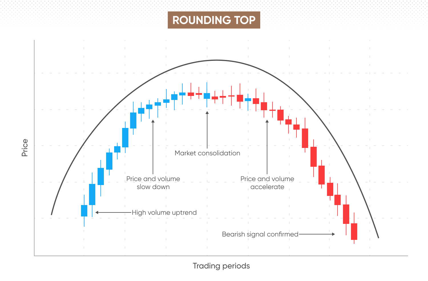
Rounding tops are bearish patterns, where the candlesticks form an inverted 'U' shape, signalling that an extended uptrend is gradually reversing and likely to turn downwards.
-
The curve starts with an uptrend, where trading volume is high due to bullish pressure.
-
As the price reaches the top of the curve, volume decreases, indicating a consolidation phase as the bullish momentum slows.
-
The curve then descends as price and volume decline, driven by increasing bearish momentum.
The rounding top pattern is confirmed when the price continues to trend downwards after the first candle that closes below the price level that preceded the start of the pattern.
Head and shoulders
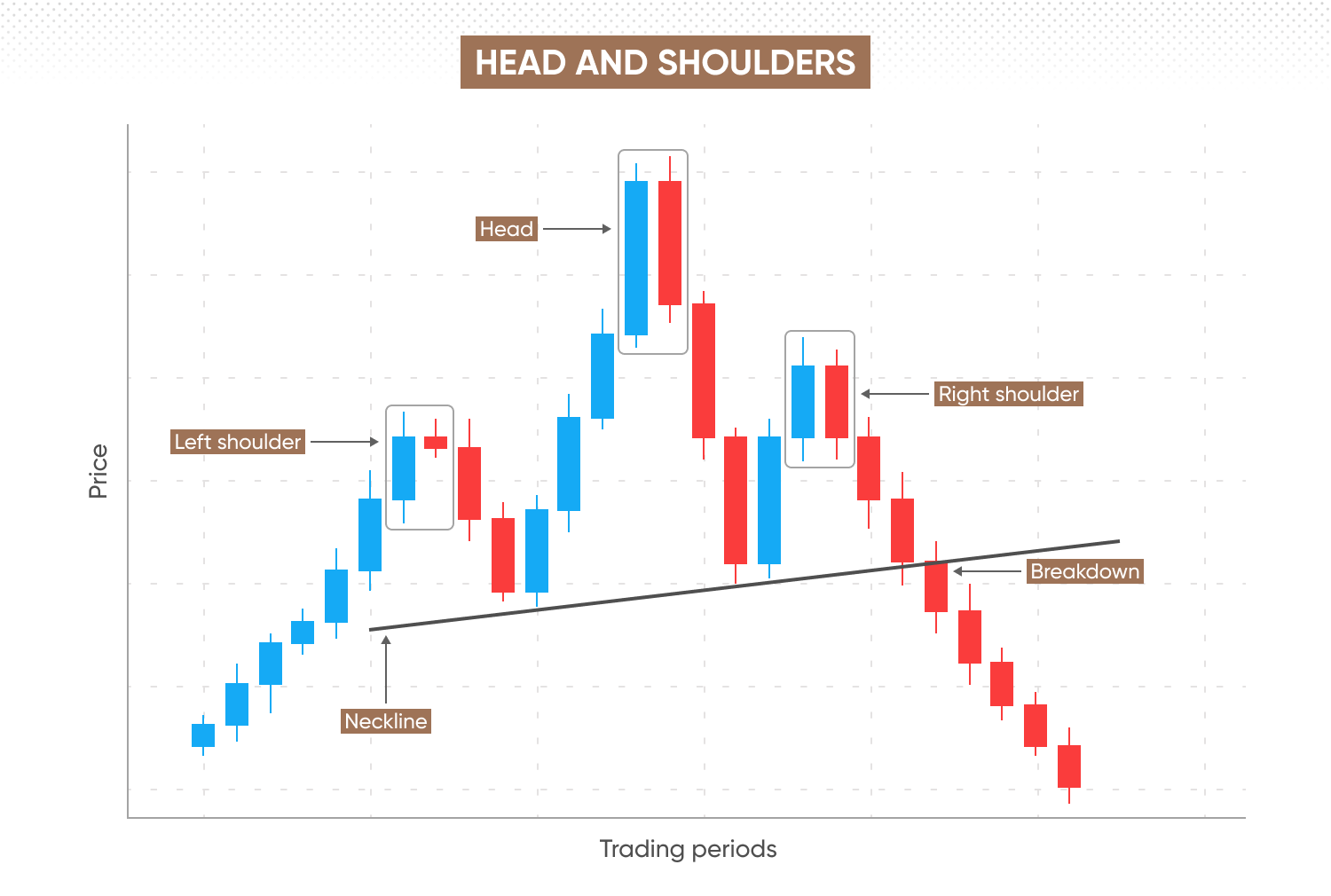
Head and shoulders is a reversal pattern that signals a shift from bullish to bearish market direction.
The pattern forms when three peaks appear in sequence on the chart, each followed by a decline. The first and third peaks create the left and right shoulders, which are typically similar in height. The second peak, the head, is the tallest, reaching higher than either shoulder. A neckline is drawn at the lower points of the declines, acting as the support level.
-
The uptrend encounters resistance and declines, signalling potential overbought conditions. This forms the left shoulder.
-
The market bounces back from the support level and resumes upward momentum.
-
Bullish volume drives the price to its highest peak – the head – before facing resistance and falling back to the support line.
-
The market rises again, but the peak is at a similar height to the first, forming the right shoulder.
The bearish signal is confirmed when the price breaks below the neckline and continues to fall, often accompanied by increased trading volume.
Inverse head and shoulders
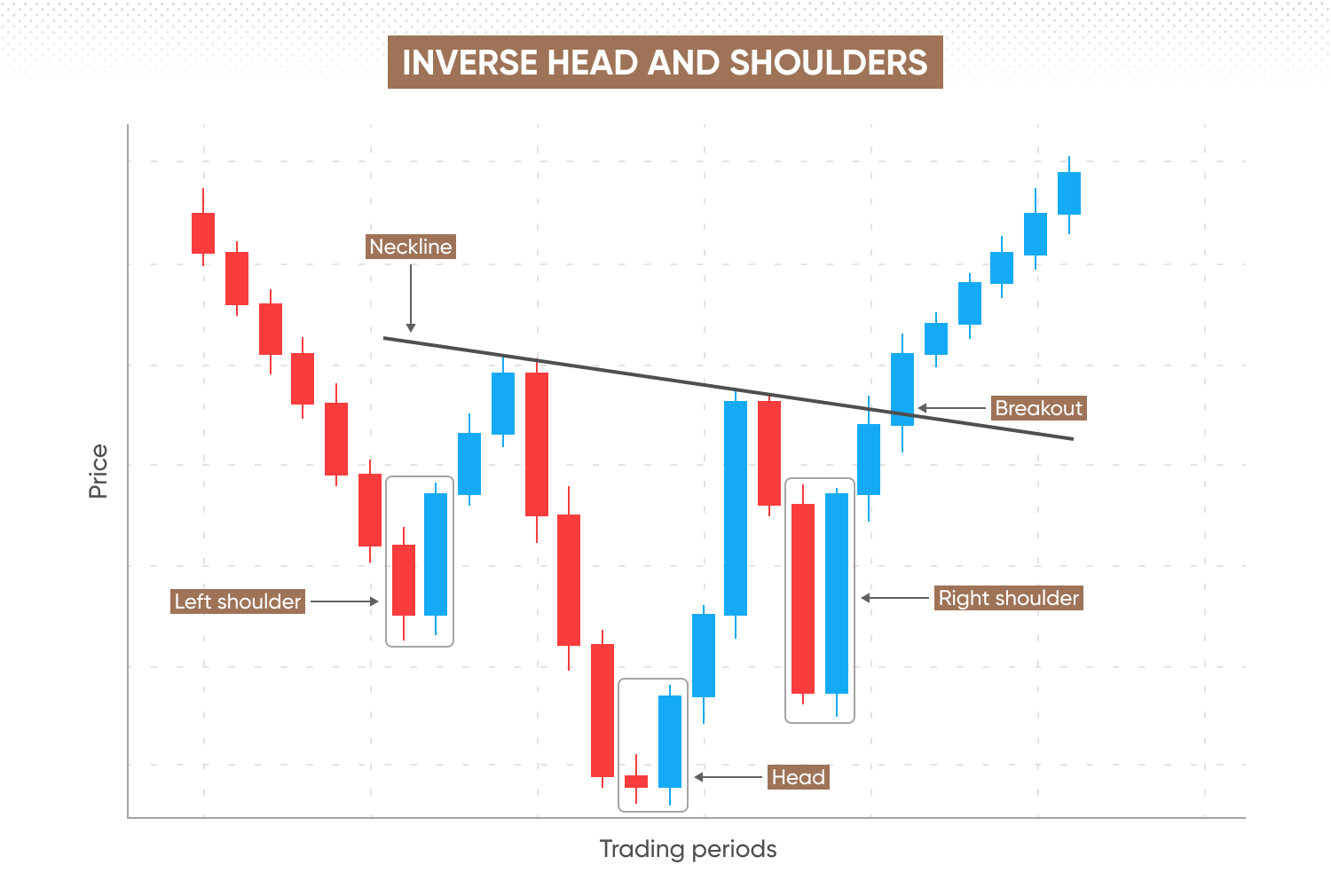
Inverse head and shoulders is the bullish counterpart to the head and shoulders pattern. It signals the reversal of a downtrend into an uptrend.
The pattern forms when three troughs appear on the chart, each followed by an uptick. The first and third troughs, which are similar in depth, form the left and right shoulders. The second trough, the head, is the lowest, dropping deeper than either shoulder. A neckline is drawn across the peaks of the recoveries, acting as a resistance level.
-
The downtrend faces support and moves upward, indicating potential oversold conditions. This forms the left shoulder.
-
The market resumes its downward momentum.
-
Bearish volume drives the price to its lowest point—the head—before reversing upward.
-
The market declines again, reaching a trough similar in depth to the first, forming the right shoulder.
The bullish signal is confirmed when the price breaks above the neckline (resistance level) and continues to rise, often accompanied by increased trading volume.
Apply your chart patterns knowledge
You can apply your technical analysis skills across a range of global markets on our intuitive, user-friendly trading platform, with easy access to comprehensive education and round-the-clock support.
FAQs
How to trade with patterns
To trade using chart patterns, integrate them into a strategy that matches your trading style and risk tolerance. When a pattern forms, use technical indicators like MACD or RSI to confirm it. Check market news for macroeconomic factors that might disrupt the pattern. Support and resistance lines help identify overbought or oversold conditions, guiding your entry and exit points.
How to read trading charts
There are several ways to chart market activity, with line charts and candlestick charts being the most popular. Candlestick charts, commonly used on trading platforms, show detailed intraday data, including the open, high, low, close prices, and trading volume. This allows for the identification of specific chart patterns that don’t appear on line charts, which only track single values.
How many types of chart patterns are there?
Chart patterns fall into three categories: continuation, reversal, and bilateral.
-
Continuation patterns suggest the current trend will continue.
-
Reversal patterns indicate the trend will reverse.
-
Bilateral patterns signal a potential breakout, but the direction is uncertain.
These patterns can further be classified as bullish (price trending up) or bearish (price trending down).
Related technical analysis guides
Explore further resources on technical analysis, including tools, indicators, and market patterns.

Relative strength index (RSI)