Two Conflicting Patterns Form on S&P 500
During the last seven trading sessions, the S&P 500 has formed two candle patterns. With these patterns directly opposing each other, let’s explore which pattern is best placed to win out over the coming weeks.
During the last seven trading sessions, the S&P 500 has formed two candle patterns. With these patterns directly opposing each other, let’s explore which pattern is best placed to win out over the coming weeks.
Start with the Bigger Picture
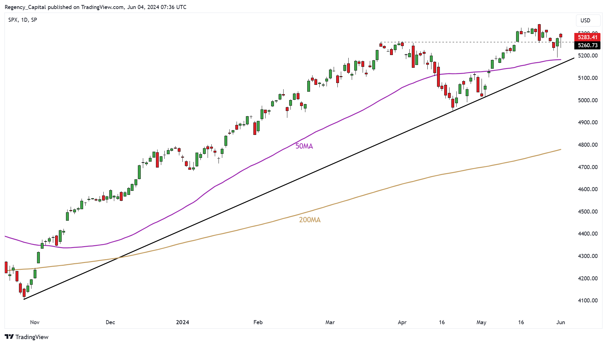
Before we get into the individual price patterns, it is always a valuable exercise to zoom out on your price chart and start with the bigger picture. When we do this on the S&P 500, we see a market that has been locked in an uptrend since autumn 2023.
After a deep retracement in April, the S&P 500 resumed this uptrend in May – retesting and briefly surpassing the highs reached in March. The March highs mark a key line in the sand for the short-term health of the S&P’s uptrend.
S&P 500 Daily Candle Chart: Zoom Out
 (Past performance is not a reliable indicator of future results)
Two Opposing Price Patterns
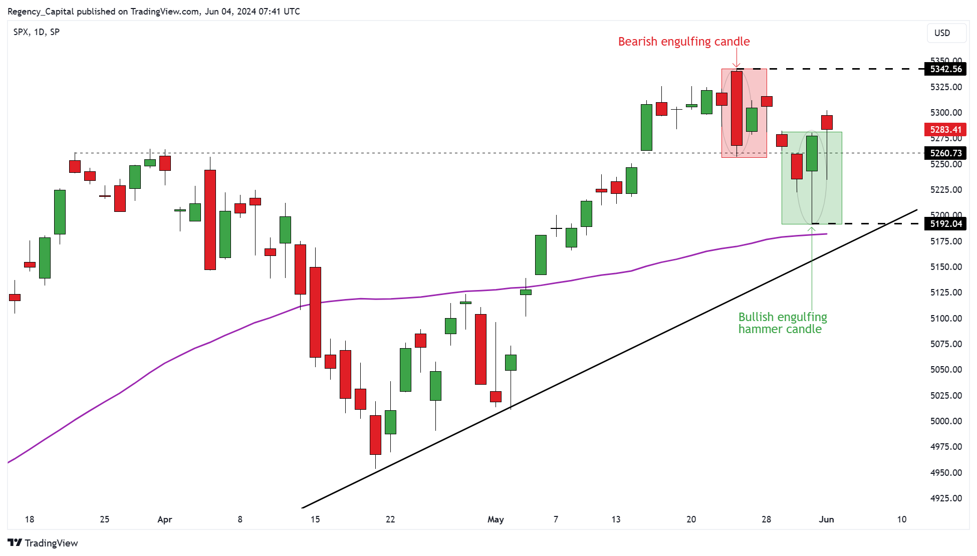
Zooming into the daily candle chart highlights the two opposing price patterns that have formed on the S&P 500 during the last seven sessions:
1. Bearish Engulfing Pattern: On 23rd May, the S&P printed a large bearish engulfing candle which eclipsed the prior five days’ worth of trading ranges. The top of the bearish engulfing pattern now represents a key level of resistance for the market.
2. Bullish Engulfing Hammer Candle: On 31st May, the S&P formed a bullish engulfing hammer candle pattern. This pattern is a hybrid of the bullish engulfing and bullish hammer candle patterns. The low of this pattern now represents a key level of support for the market.
S&P 500 Daily Candle Chart: Zoom In
 (Past performance is not a reliable indicator of future results)
Which Pattern Will Win Out?
Whilst we’re asking the question, the beauty of short-term trading is that we don’t need to care about the answer. The patterns have created two key levels in the market from which we can construct trade plans which represent a series of ‘if – then’ scenarios. For example:
IF: the market retests the key support level created by the bullish engulfing and forms a bullish reversal pattern on a lower timeframe.
THEN: I could look to initiate a long position with a stop below support.
This is just one example of how you can use key levels created by higher timeframe patterns to construct trade plans that allow you to focus on executing trades on lower timeframes.