What is a bar chart?

What is a bar chart?
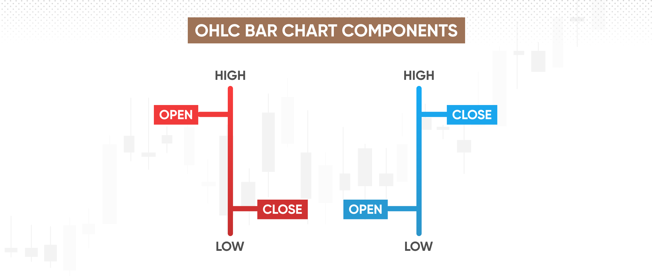
A bar chart or bar graph that presents data with rectangular bars proportional to the values they represent. In trading and technical analysis, however, the bar chart definition is different. Often referred to as the OHLC (open, high, low, close) bar chart, it illustrates price movements of a financial instrument over time.
The power of bar charts can be found in their straightforward design and adaptability. Conventional bar charts can aid traders in visualising financial data like tracking trading volume over a period, or analysing the balance sheets of different companies as part of fundamental analysis.
Meanwhile, the OHLC bar charts can aid technical analysis in a similar way as candlestick charts do. Grasping the essentials of a bar chart — from its uncomplicated layout to its competent interpretation — is an indispensable ability in the financial world.
Key highlights
-
Bar charts in their conventional form display data with rectangular bars proportional to their values. In trading, however, bar charts refer to OHLC (open, high, low, close) charts, detailing price movements over time to aid technical analysis.
-
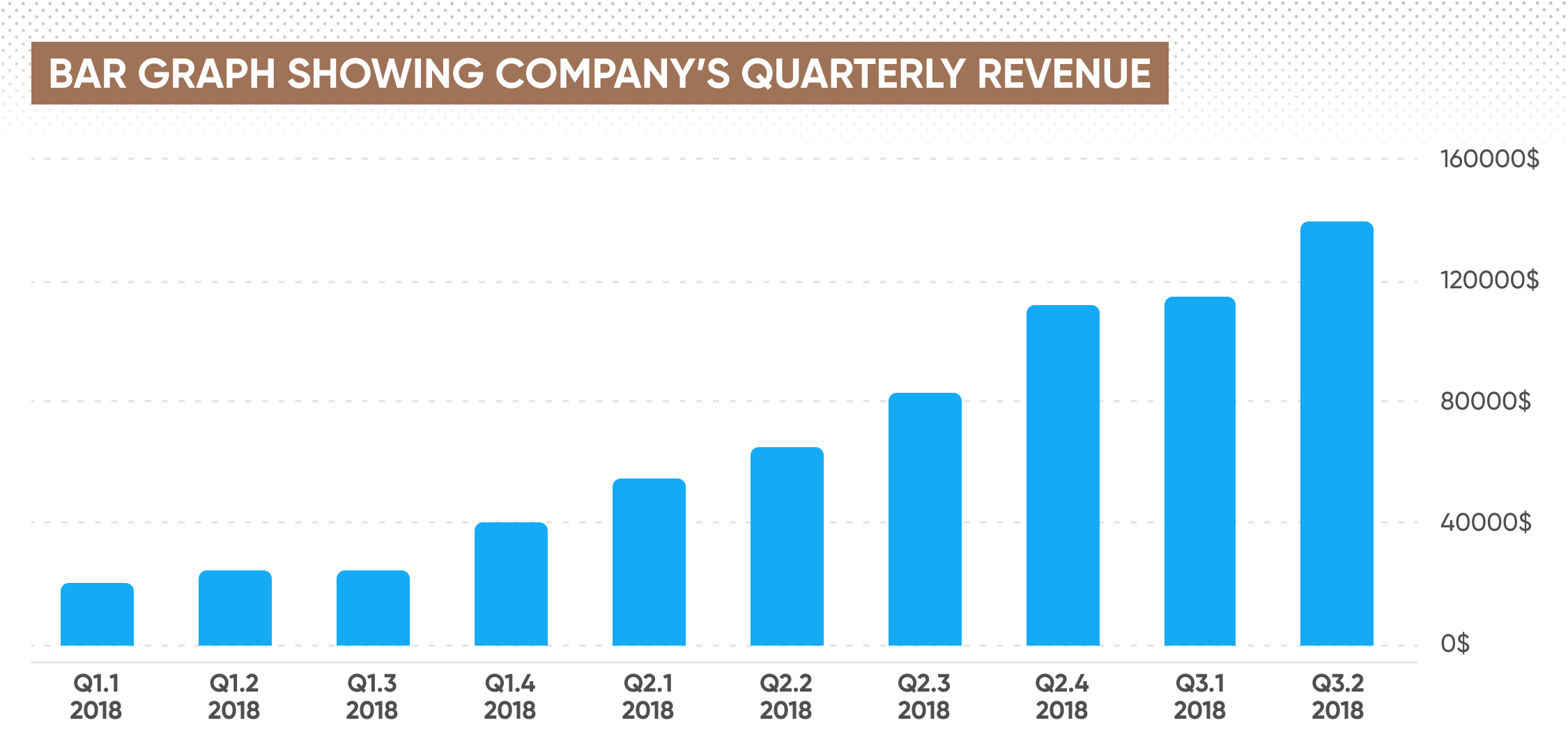
The basic structure of a conventional bar chart includes an X-axis to display data categories, a Y-axis for numerical scales, and bars to depict data magnitude. The bar length or height indicates the data quantity or magnitude.
-
In trading, OHLC bar charts visualise price movements over time, assisting in the identification of trends and patterns crucial for trading decisions.
-
Bar and candlestick charts, while similar, have different presentation styles. Candlestick charts provide more visual depth, highlighting price patterns and market sentiment.
Bar chart explained
At its core, a conventional bar chart is one of the simplest and most intuitive ways to represent data visually. The bar chart consists of rectangular bars, each denoting a specific category or group. The length (or height, depending on the chart's orientation) of these bars corresponds to the magnitude of the data it represents.

To get a good grasp of a bar chart, one must first understand its basic structure. Every bar chart is made up of:
-
X-Axis: This is the horizontal axis, which displays the distinct categories into which the data is divided.
-
Y-Axis: This is the vertical axis, showcasing the numerical scale. It's typically representative of a frequency, a percentage, a price or any other numerical value.
-
Bars: These are the rectangular shapes that denote specific categories or groups. The length or height of these bars corresponds to the data magnitude.
-
Legend (optional): This is an explanatory component that aids in understanding the colours or patterns used in the bars, especially when multiple data sets are presented.
Now, depending on your needs, you might come across vertical or horizontal bar charts. The main difference between the two is their orientation.
In a vertical bar chart, the categories are distributed along the X-axis with the frequency or magnitude represented on the Y-axis.
A horizontal bar chart simply flips this structure, representing categories on the Y-axis and their frequency or magnitude on the X-axis.
When it comes to interpreting a bar chart, the key is in the bars themselves. The length or height of each bar indicates the quantity or magnitude of the data. A longer bar represents a greater quantity, while a shorter bar corresponds to a lesser one. In the case of grouped bar charts, you can also compare categories within groups for further insights.
Bar charts vs other charts
It’s also worth putting bar charts into context with other chart types.
-
Line graphs: are better suited for representing trends over time.
-
Pie charts: Often employed to show parts of a whole.
-
Scatter plots: Used for revealing correlations between two numeric variables.
-
Bar charts: Used for comparing numerical values across distinct categories.
Bar charts in trading
Bar charts in trading and technical analysis, often referred to as 'OHLC' (open, high, low, close) bar charts, have a different objective and structure.
Each 'bar' here represents a specified period— a day, an hour, a minute, depending on the chosen time frame. A single bar contains information about the opening price, the closing price and the highest and lowest prices during that period. Colour coding, typically green or blue for bullish movements and red for bearish ones, adds an extra layer of interpretative ease.

The purpose of these charts is to visualise price movements of a financial instrument over time, aiding in the identification of trends and patterns, crucial for making informed trading decisions.
While both types of bar charts - conventional and OHLC bars - share a common name, their structures, uses, and interpretations are distinct, reflecting the diverse ways data visualisation techniques can be applied across fields.
Bar charts vs Candle charts
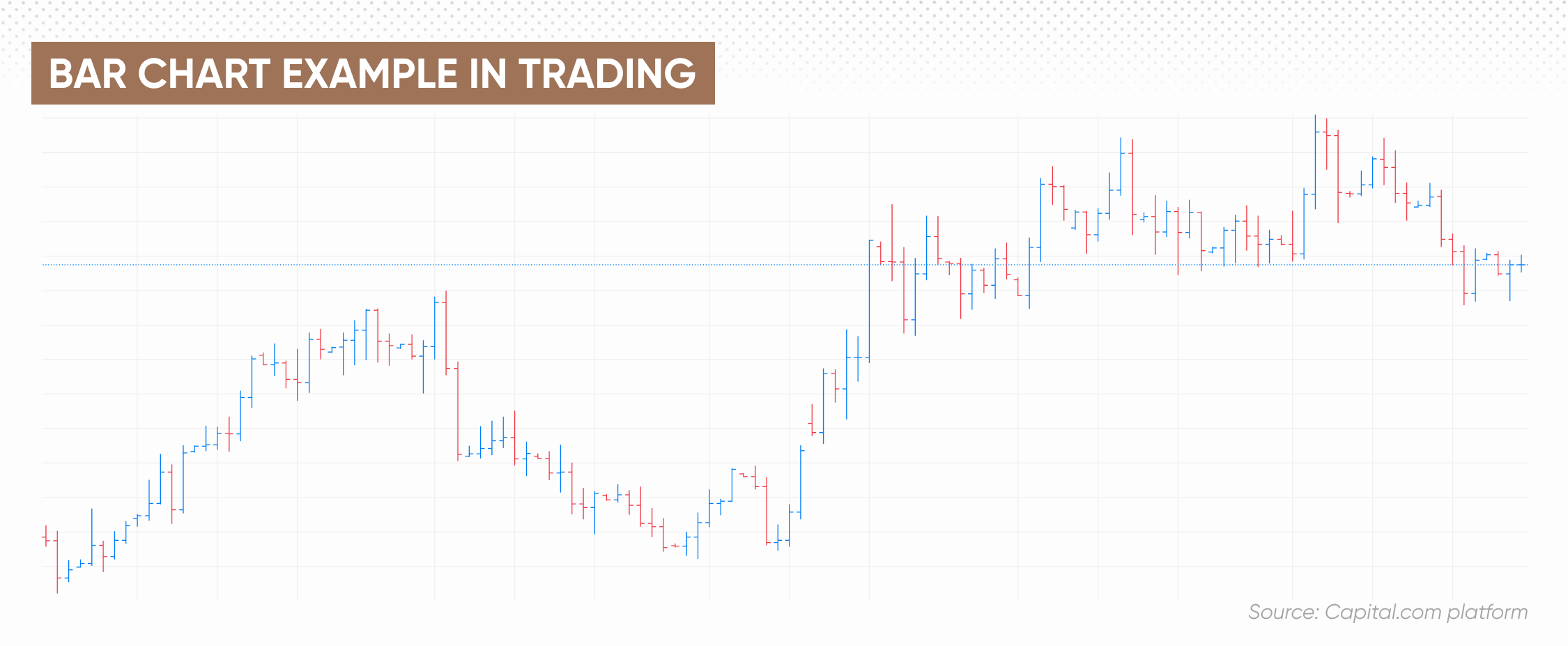
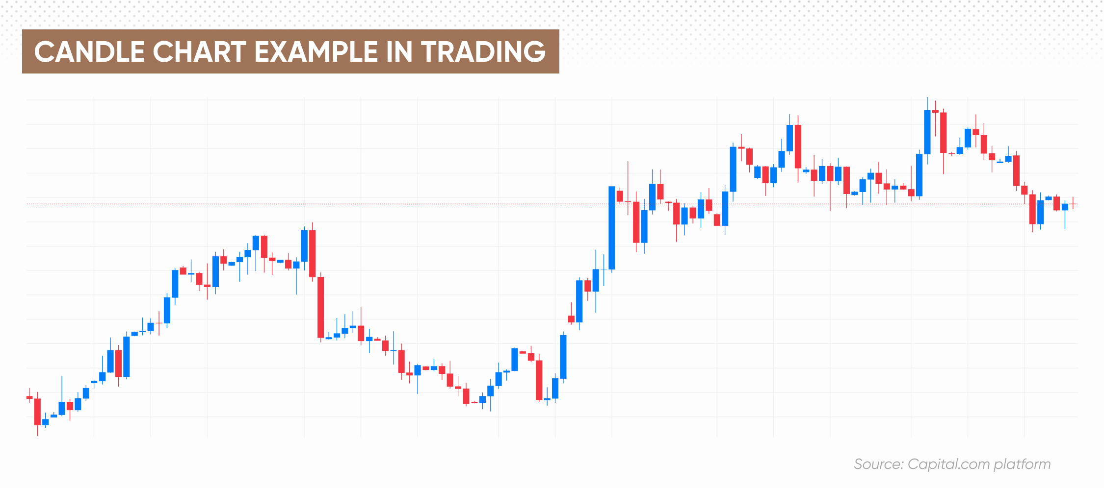
While bar and candlestick charts both display the same price information for securities — open, high, low, and close prices — their presentation styles and interpretation differ. Let’s take a look at the following candle and bar chart examples with explanation.
A bar chart presents price information using a simple vertical line for each time period. The top of the line marks the high price, the bottom marks the low, and small horizontal dashes on either side indicate the opening and closing prices. This design provides a clear, straightforward visualisation of price movements.

On the other hand, a candlestick chart, originating from 18th-century Japan, is visually more distinctive. It uses a 'candle' format, where the 'body' (the rectangular area) of the candle represents the range between the open and close prices. The 'wick' or 'shadow' indicates the high and low prices. The colour coding is similar to bar charts - green or blue for upward movements, and red for downward movement.
While both are helpful in technical analysis, candlestick charts tend to be more popular as they provide more visual depth, highlighting price patterns and market sentiment more intuitively.

How to use bar charts in trading and investing
-
Fundamental analysis: Conventional bar charts can be used to represent key financial data from company balance sheets, such as revenues, net income or earnings per share (EPS) across multiple years, enabling a clear comparison of a company's financial health over time.
-
Trading volume analysis: Traders can use a conventional bar chart to plot trading volumes of a particular security over time. This visual representation can help identify patterns, trends and high-volume trading periods.
-
Sector performance: A conventional bar chart can show the performance of different sectors within a specific timeframe, giving investors an idea of where the market strength is concentrated.
-
Economic indicators: Conventional bar charts can be used to represent macroeconomic data like gross domestic product (GDP) growth, unemployment rates or inflation rates, enabling investors to understand economic trends and make informed decisions.
-
Technical analysis: Leveraging OHLC bar charts, traders can identify market trends, spot price reversals, recognise price patterns, analyse market volatility, compare opening and closing prices, and observe high and low price points to effectively inform trading decisions and strategies.
Conclusion
In sum, bar charts serve as versatile tools in both the world of data visualisation and financial trading. Their simple design presents data in an easily digestible form, enabling viewers to draw key insights from the length or height of bars.
When it comes to trading and investing, bar charts take on a distinct form and function in the shape of OHLC bar charts, providing a detailed view of price movements. However, one must bear in mind that while bar charts are incredibly useful, they are just one of many chart types, each with their own strengths and appropriate use cases.
A well-rounded understanding of these tools can equip a trader with a powerful arsenal for data analysis and decision-making. Yet remember to always conduct your own due diligence before trading, and make sure to test your strategy using a demo account before risking real money.
FAQs
What is a bar graph used for?
A conventional bar graph is used to display and compare numerical data across various categories. In the world of trading and technical analysis, OHLC bar charts are used to represent price movements of a security over a time period.
How to read a bar chart?
To read a standard bar chart, identify the categories on the X-axis and the numerical scale on the Y-axis. The length or height of the bars represents the quantity or magnitude of the data. For an OHLC bar chart, each bar displays the open, high, low, and closing prices of a financial asset for a particular period.
What is the difference between a bar chart and other types of charts?
Bar charts are unique in their capacity to compare quantities across categories, in contrast to line graphs that are excellent for displaying trends over time, pie charts for showcasing parts of a whole, and scatter plots for exhibiting correlations between variables. In the realm of trading, OHLC bar charts are used to illustrate price movements over time. Meanwhile, candlestick charts, another tool in financial trading, offer a more visually striking representation of price information.
What are the key benefits of using bar charts in financial market analysis?
Bar charts in financial analysis provide a clear, visual representation of data—helping to track trading volumes, compare financial metrics across companies, or observe sector performance. OHLC bar charts specifically allow traders to discern market trends and price patterns, aiding in informed decision-making.