What is a candlestick chart?
A candlestick chart is a candle-shaped chart showing the changing prices of a security. It usually shows the opening price, closing price, and highest and lowest prices over a period of time.
Key takeaways
-
Candlestick charts consist of candlesticks that represent price fluctuations of a security.
-
A candlestick has a body, top and bottom wicks, and can be green (or blue) and red depending on whether prices increased or declined.
-
One candlestick represents a time period such as a day, a week or a minute, depending on the trading set-up.
-
Traders can see open and closing prices, as well as the highest and lowest points in a candlestick.
-
Common candlestick patterns include doji, spinning top, hammer, hanging man, and many more.
Understanding candlestick charts
There are key components of a candle traders should be aware of to read candlestick charts:
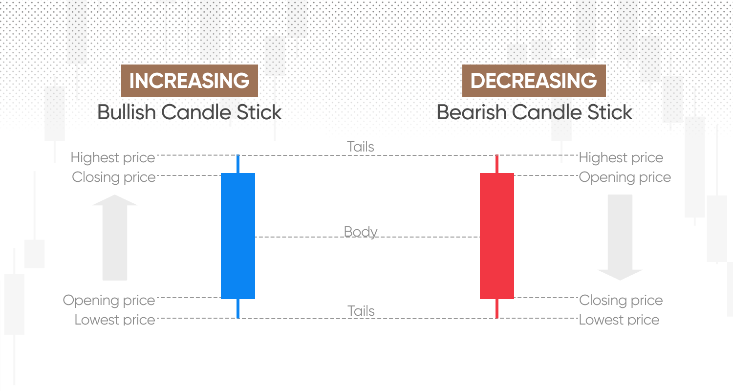
Body: This is the thick bar section of a candlestick and it shows the difference between the opening and a closing price over the trading session.
Top wick or tail: This is the line extending above a body and it shows the highest point the price reached over a trading session.
Bottom wick or tail: This is the line extending below a body, and it shows the lowest price point over a trading session.
Colour: The colour of a candlestick is important as it defines whether the price has overall increased or decreased. Traditionally, green colour has been used for price increases, with the opening price at the bottom and closing at the top. Some platforms can use blue instead of green. Red candlesticks have been used to represent falling prices, with the opening price at the top and the closing price at the bottom.
How to read candlesticks explained
Candlestick charts or candle charts are a useful trading tool as each candlestick can reveal four points of data:
-
Open: This is the price that an asset starts a trading session at and is represented by the body’s bottom for the green (or blue) candles, and the body’s top for the red candles.
-
Close: This is the price where an asset finishes the trading session. It’s represented at the top for green (or blue) candles, and bottom for red.
-
High: The highest price point in a trading session. If a candle stands for a day, this would be called an intraday high.
-
Low: And vice versa, this is the lowest price point in a trading session. For a daily candle, this would be called an intraday low.
Using these data points traders can interpret the price movements quickly and efficiently. They can also search for repetitive candlestick patterns of specific candle shapes and forms such as different lengths of wicks, or bodies, or their proportion to each other.
Candlestick chart patterns
There are various forms and shapes that are used by traders for reading candlestick charts. Generally, these can be grouped into bullish and bearish, with some patterns being able to point to both directions.
-
Bullish candlestick patterns: Indicate bullish momentum
-
Bearish candlestick patterns: Indicate bearish momentum
Some of the common candlestick chart examples include doji candles, a spinning top, a hanging man and a hammer. But there are many more.
Doji
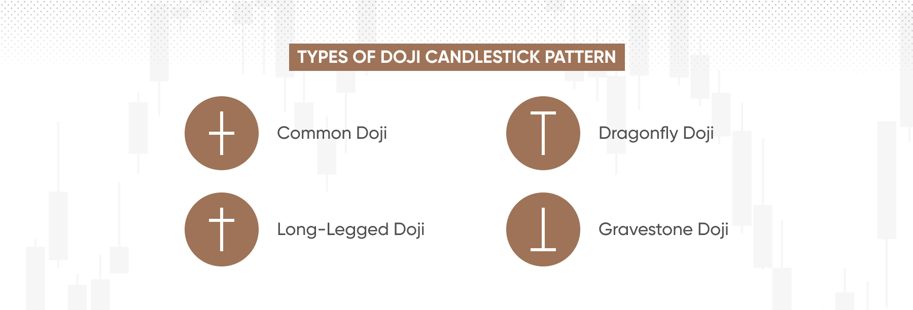
A doji candle pattern has open and closing prices of the same level, meaning that even if significant market fluctuations happened during a session, the price level returned to its original point. This candlestick pattern represents indecision.
There are three types of doji distinguished by traders:
-
Common doji: a doji with equal wicks
-
Long-legged doji: a doji with a long bottom wick, but short top wick.
-
Gravestone doji: a doji with a long head, but no tail.
-
Dragonfly doji: A doji with a long tail, but no head.
Spinning top
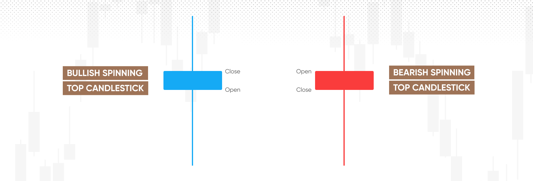
A spinning top has a small body positioned in between longer upper and lower tails. Just like a doji candle, a spinning top represents indecision in the markets. The size of the short body means that the difference between open and close is relatively small. The long upper tail would suggest that while price soared, buyers could not maintain the bullish momentum.
Hanging man
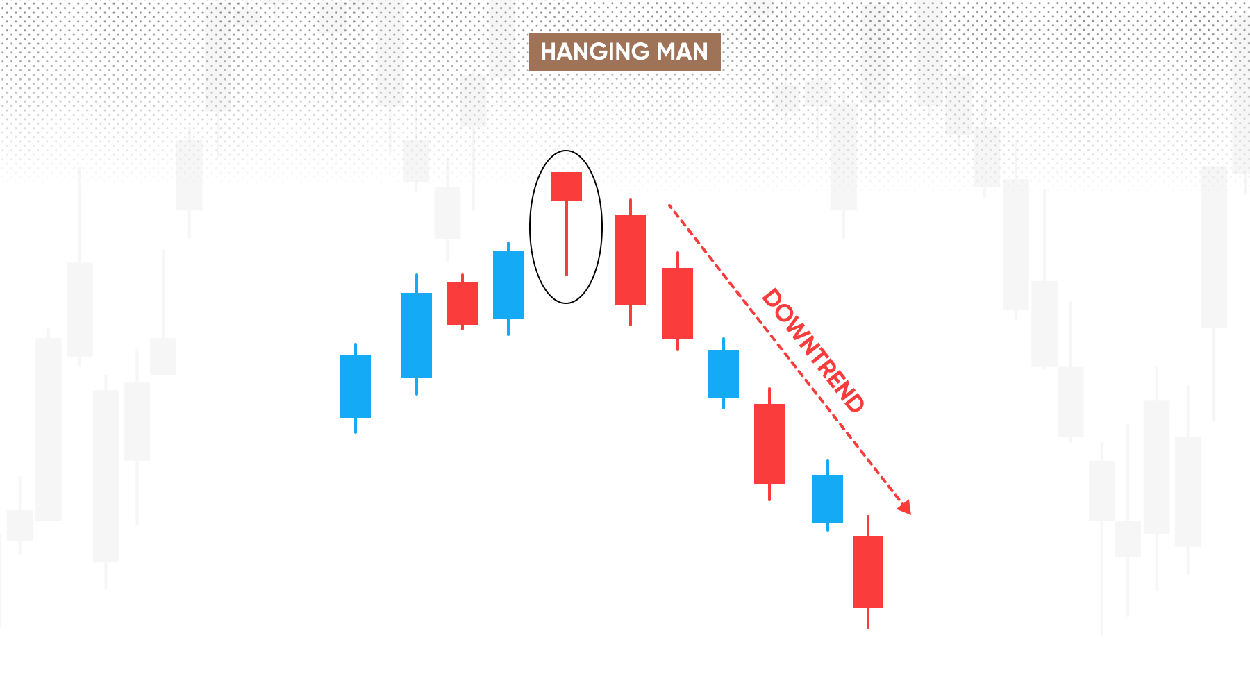
This is a bearish reversal pattern, which signals that the prices may start falling after an uptrend. A hanging man has a small body yet long tail, indicating that the bottom price point was much lower than where the price has opened and closed. It typically means that the bullish momentum is winding down.
Hammer
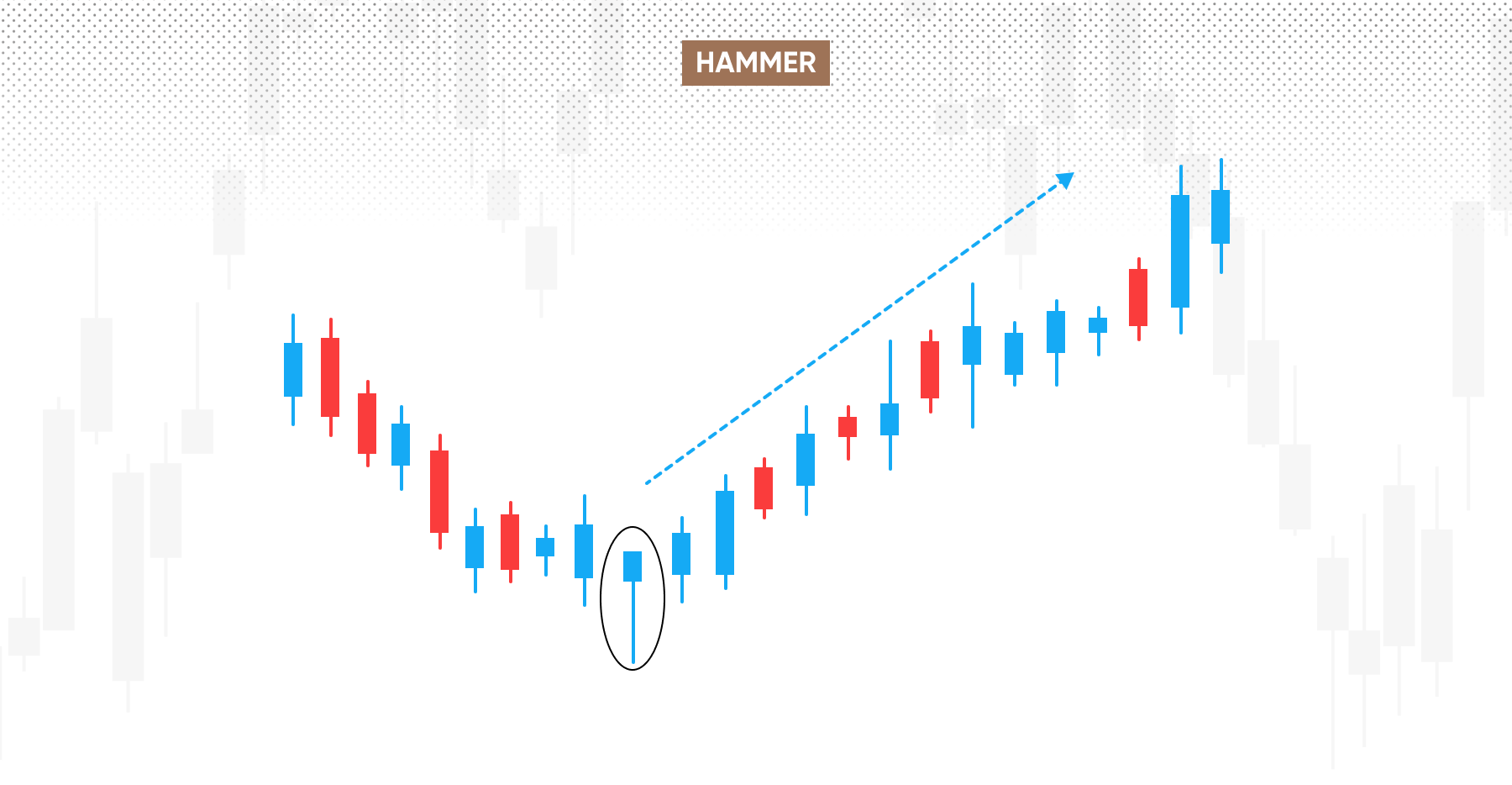
A hammer candlestick is exactly what it sounds like: a hammer. It has a relatively small body, and a lower tail that’s at least twice longer. It occurs after a downtrend and is typically seen as a bullish reversal signal, indicating that buyers absorb selling pressure.
Other candlestick patterns
Depending on who you ask, there are somewhere between 35 and 75 different candlestick patterns, including but not limited to:
| Abandoned babies | Shooting star | Gapping taduki |
| Engulfing pattern | Tweezers | Last engulfing |
| Harami cross | Three inside/outside | Matching low |
| Piercing | Three line strike | In/On neck line |
| Harami | Three white soldiers | Thrusing line |
| Kicker | Three white crows | Two black gapping candles |
| Dark cloud cover | Three inside/outside down | Matching low/high |
| Window | Separating lines | Meeting lines |
| Tri star | Descending hawk | Upside tasuki gap |
| Doji star | Horning pigeon |
Why use candlestick charts?
-
State of the market at a glance: Candlestick charts provide a visual representation of price dynamics that’s effective and quick to grasp.
-
Reveal patterns: Candlestick charts can reveal patterns of how an asset’s price has behaved over time.
-
Supported by most trading platforms: They are available on most trading platforms with indicators and tools already embedded in the interface.
Limitations of candlestick charts
-
Patterns depend on a time-frame: Candlestick patterns would change depending on a time period one candle represents, which is changed manually by a trader. This can provide additional challenges in spotting patterns.
-
Lagging indicator: Candlestick chart patterns reveal how the price behaved in the past, and past performance is not a reliable indicator of future returns.
-
Doesn’t reveal long-term trend: Candlestick charts provide a state of current market environment, but doesn’t reveal a long-term trend on its own.
Conclusion
Candlestick charts can provide traders with visual representation of the current market environment. They are effective tools to monitor price action and identify patterns.
A candlestick contains a body, top and bottom wicks, which represent opening and closing prices, as well as the highest and lowest points. A candlestick can be green (similarly as blue) or red, and it represents a time period such as a day, a week or a minute, depending on the setup.
Candlestick chart patterns are used by traders to identify motifs in the way asset prices behave, yet they don’t guarantee future returns. Some of the commonly used patterns include doji candles, a spinning top, a hanging man, a hammer, and many more.
Candlestick charts provide traders with a quick glance on the state of the market, they can reveal patterns and are supported by many trading platforms. Yet the patterns can change, depending on the timeframe chosen. They are also a lagging indicator and don’t reveal long-term trends.
FAQs
What are candlestick charts used for?
Candlestick charts are used in trading to identify patterns, signals, reversals and the overall market momentum. Traders use them to guide decision-making.
What are candlestick charts in simple terms?
A candlestick chart is a candle-shaped chart showing the changing prices of a security.
How do you analyse a candlestick chart?
Candlestick charts are a useful trading tool as each candlestick can reveal four points of data: open, close, highest and lowest price points. Using these data points traders can interpret the price movements quickly and efficiently. They can also search for repetitive candlestick patterns of specific candle shapes and forms such as different lengths of wicks, or bodies, or their proportion to each other.
What is the difference between a candlestick and a line chart?
Line charts track price movement over time, while candlestick charts track price movement plus provide insight into buying and selling patterns by showing open, close, highest and lowest price points over a unit of time.
How do you know if a chart is bullish or bearish?
There are bullish and bearish candlestick chart patterns traders can search for to identify whether a chart is bullish or bearish. Traders should familiarise themselves with these patterns to be able to use them.
Visit related finance terms

What is bar chart

What is mountain chart
